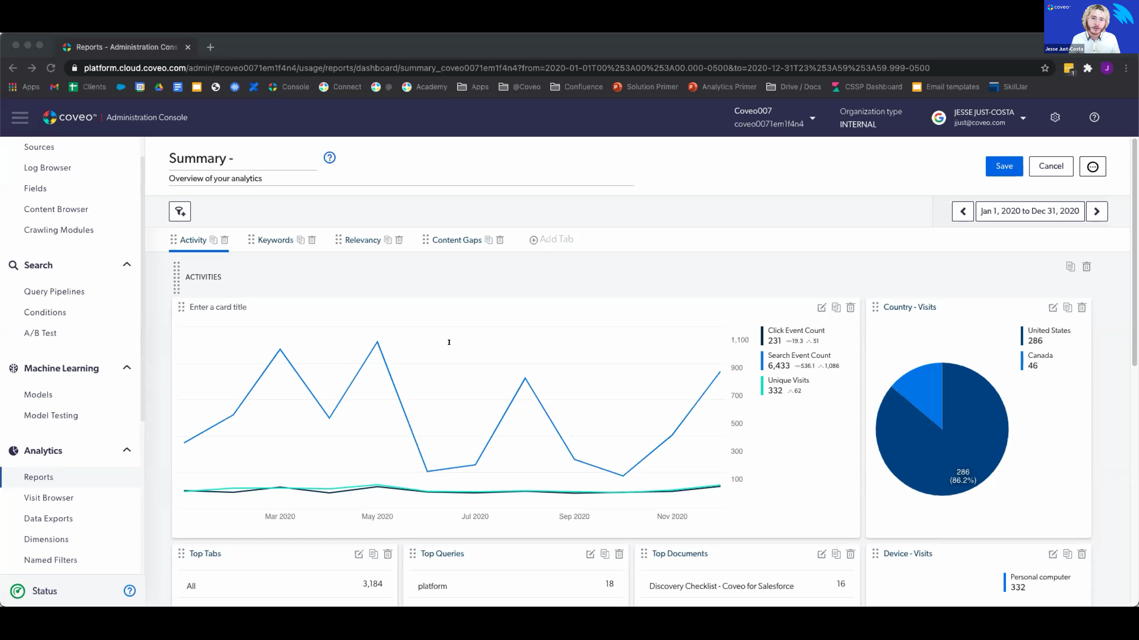
Hello, everyone. Welcome to another learning series webinar. My name is Claudine Ting, and I work on the global marketing team here at Coveo. For those who are attending the learning series webinar for the first time, this monthly webinar is where we get more hands on with how to enable Coveo's features that can help you create more relevant experiences. This is the second session in our three part series on search performance. For this session, we'll focus on the usage analytics engine. Before we get started, I just have a few housekeeping items to cover quickly. For this webinar, we encourage you to type your questions on the q and a box and the chat box as we go along. At the halfway point and at the end of the presentation, we'll try to provide a short recap of the questions being asked. Lastly, today's session is being recorded, and you'll receive the presentation within the next few days. Today, we're welcoming back Jasbeth and Jesse Jess Costa, our onboarding specialists here at Coveo. We also had a lot of questions from the audience last month, so we brought some reinforcements with us. We have Latika Vrama, customer success architect, and Hamid Jiricci, onboarding manager, providing support with answering questions. So I think we're ready to get started. Jesse, Jazz, take it away. Awesome. Thank you, Claudine. Appreciate that. So welcome guys to your part two. Our today's agenda looks a little bit like this. So we get our just overview of what the analytics are, why they're important, and why we should use them. We have some key concept to discuss with you guys because those are the ones that you will be working with and, pretty much using them when it comes to creating reports, understanding from the reports, and creating reports as well. We have a quick demo as well and a q and a sessions at the end right after the demo. And we have, just couple of slides, one or two slides around. Some resources are available to you guys. We'll show you where to find them and how to find them as well. And like Claudine said, I do know the q and a is right after the demo, but please feel free to, ask your question in the chat. We have Lipka and Hamid really here for that. We want this to be as interactive as possible because this session is all, informative. We wanna make sure that you're understanding the content that we're is being presented to you guys today, and just clearing things up. We'll try to answer as much as a question as we can. And if we cannot answer your questions, we'll definitely take it, off the webinar, to make sure that you know, get the answers to those. So let's get started. When it comes to, analytics, we like to think about them as being about people inside action. Most of the users, when it comes to analytics, they people like to use it as understanding what they're doing and how they're doing. But for us, we want to pinpoint not only the performance, but we want to pinpoint the users behaviors as well. I feel like, you know, as businesses, as organizations, we sometimes tend to forget that our users and their behavior is important for us. Not only to kind of reduce the cost of, things that we're doing around our services and, you know, product that we are providing, but also, measuring how we're doing in general. So for example, I like to say that, you know, when it comes to providing content to our users, we kind of go on the fact that, you know, we want to provide this. We think that this is going to be a good content for them. We think that's for them, that's the best for them, but then not that might not be the case. This is where it's important to understand where your audience is coming from, who they are, what they're looking for, and what matters to them. And when you're tackling these three points, you will understand that, with the analytics, you might have some team or resources working on creating a portion of the content or some particular content, that people might not even look at. And that's where it's important to understand your behavior. So you can take those resources and kind of redirect them to the right direction and actually provide, the content that your people are looking for. So user behavior is super important when it comes to analytics and understanding what they're looking for. And of course, it comes hand in hand with performance. We want to make sure to improve our performance as well. When it comes to this, there's three different words that, I kind of like to pinpoint whenever I'm talking to our customers and it's relevancy, accessibility, and availability. Is your content relevant? What I mean by this is, if I'm on your website and I'm looking for something, are you showing me the right content? Example, if I'm looking for a Dell laptop on your website as information and you're showing me Toshiba laptops, that's not relevant to the to my search. That was not what I was looking for. Therefore, we need to improve that. So my content was not relevant. We need we will have to correct this. Is it accessible? So what I mean by this is how easily is your content findable? If I'm doing a query on your website, how long does it take me to get to the results? Do I have to click on filters? Do I need to sort things out? And adding these different steps is reducing the accessibility to the relevant content from our users. And the last but the need the least is, content availability. So content availability is do you actually have the content that your people are looking for? Does it exist? Do you need to create a new content? So these three things are very important when it comes to understanding and improving your overall performance. We do have some key points to discuss today. So like I said, important key concepts that you guys will be working with, in your day to day when it comes to leveraging Covid usage analytics. If you're already working your reports, you know them already. They're called dimensions and metrics. So let's start with dimensions. Dimensions are pretty much what I kinda like to explain as the what. So your questions. You come up with different type of questions, things that you want to know about your visitors, things you want to know about your users, and dimensions are here to provide that context. So basically, if I'm taking an example, let's say, where does my user comes from? It could be countries, like, which countries, which cities, what kind of browser they're using, did they, you know, what kind of tab that they clicked on, or, what device that they were using, what was the query, where was the result situated, what was the result, how many queries, all these things are part of dimensions. Now luckily for you guys, there's sixty seven dimensions already available in your Covio admin console, meaning that those are the things that are being already tracked automatically by Coveo, but it doesn't have to stop there. Why? Because each one of you present during this, today on the webinar, you might each have a different use case, but not only that, you might have some different department asking you to track different things. For example, you know, marketing can be asking you to track A and then human resources are asking you to track B. So how do you do that? If it's not available in those sixty seven dimensions available you can create your own dimension. We'll see quickly in the demo how you can do that, but definitely leverage those. So dimension is not only available to create filter and customize your report, you can really leverage though to understand and track whatever is needed to your own use case. We have three different type of dimensions. We have click, search, and custom. Basically custom ones that are the ones that you create, and then click and search ones. They're pretty self explanatory. If you do wanna have a little bit more information about these, we have resources available where you can, go and learn more about, what the dimensions are and what they each mean. Now moving on to metrics. You know, like I said, dimensions were about the questions, the what's, the things that you wanna track. Now it's good to ask questions, but what's better is to have the answers. So that's where metrics come in hand. Metrics are pretty much the answer to those questions. So it's a numeric value. It brings value to those questions. It could be numbers. It could be, quantities. So really, it comes from the dimensions, works hand in hand from it, and brings that value. We have, as an example, you know, I was telling you guys, you know, what kind of device people are using. So if it was, let's say, laptop, you know, PC, Apple, or mobile, these are the metrics. How many queries people are doing today? The numbers are the metrics. So we really allows you to understand, the interaction on how your visitors are behaving on your website in general. So that's pretty much it when it comes to metrics. I'll cover some of the metrics, in a second. And this is one of my favorite kind of, phrasing that I stole from our courses. As you guys know, we have a lot of courses available, and I really love this because it explains how dimension and metrics are working together. It really provides you with all the information that you need, to kind of understand your users behaviors, but on top of that, understand how successful you are. So really important to leverage those and understanding what dimensions are and what metrics are in your reports. So, on top of the, you know, measuring your success and, you know, working with metrics and dimensions, there's one other things that is super important, and those are KPIs. We all have our personal goals. Each one of you have a different use case. You want to work towards that. You want to make sure that you're measuring them and that you're actually performing. So, in general, if you have your own KPIs, that's great. If you just wanna improve the search experience for overall, you know, your users, you wanna pro provide that top notch experience, you can use our Coveo KPIs. We have a lot of metrics related to those KPIs, but in particular, we have those big four. That's what we call them. We call them the big four because they're our favorite. You will hear us, talk about these a lot. Onboarding team will talk about this a lot. You have your own CSMs, so we'll talk to you about these a lot because these are the ones that we really, kind of leverage and use to, measure performance. So you have, visit click through, query click through, average click rank, and content gap. My personal favorite ones are the average click rank and the content gap. So let's talk a little bit about average click rank and what it means. What that means is if I'm doing a search on your page, and, you know, it's related to the result list. You have the result list that comes up everybody's every time somebody is performing a search on your page. Now where is the result that I'm looking at or I'm looking for situated on that result list? Is it at the bottom? Is it on the second page? Is it on the tenth page? So this will allows you based on the query that people are doing, where is the content situation. And as you can see, under each of, those metrics, we have target averages. These are the numbers that we're trying to, you know, aim at. So we're trying to keep it under three when it comes to average click rank. We want to provide that again, easily accessible content to our users. If somebody is doing a query, we want them to have their whatever result they're looking for to be on the top three documents or product they will see on their result list. So this is what average link rank is about. Content gap is the overall favorite. I think, haven't heard one client not talking about content gap. Everybody is, kind of looking for it and make sure that nobody has a content gap. Basically, what this one does is again, you know, I was telling you about your user behavior and your performances. So content gap will allow you to understand what your users are looking for, which queries they're doing, and that you do not have a content that exists for it. But not only that, you might have some content that is misplaced and, using Content Gap, you will be able to track it back to where it's supposed to be to provide a relevant, results to your users. So content gap, you will track all the queries that people are doing. You will see why they're not able to find the result. And this will allow you if you need to create new content, you will see it there. You might be, again, you know, like I was saying, you have a resource, you have a team working on some content, and people might not even be looking at that. They might be looking at a totally different things, and you can, with this, you know, redirect your team to be working on the right thing. Not only save money at the end of the day because you will stop, working on things that people don't want, but you will also have happy and, you know, happy end users because they're finally able to find what they're looking at when they're working on your search interface. Now these are the two, like I said, my favorite ones, but let's talk about visit click through rate and query click through rate. So there are percentage. The way we calculate them is, for example, for the click visit click, what we do is, somebody is on your page. Every time a visitor comes to your page, how long or what is the way that they take before clicking on something when they're on your page? They can be doing a query or they might be not doing a query, but do they click on something when they're visiting your page? So that is the visit click through rate. When it comes to the query click through rate, it's pretty much the same, but it kind of focus and, narrows it down to the search itself. So if somebody is doing a search on your page, are they clicking on a result? Now you see it's a percentage. Right? So how how come it's not hundred percent, or why is it forty to fifty percent? The way we explain it is, for example, you know, our goal is to provide straightforward and easy easily accessible content. I've been saying that a lot, but that is the main goal here. So what do we do with the query click through search is, somebody searches for a query and then they click on a result right away, we have a hundred percent, rate. The because they were able to find what they were looking at straightforward. Now if I'm doing a search on your website and I have to, let's say, take extra step, which could be sort things out, add a filter or select more than a filter, then that will reduce my average, my, rate, my click through rate because I was not able to find what I was looking for straightforward. So these are the four big metrics that we use at Coveo to kind of, you know, measure how we're doing in general. And we definitely and strongly encourage you to use those because it can be super, super helpful into kind of proving that whatever you're doing is actually working, or do you need to change the way that you're tackling your search experience overall? Now these are the four ones, but there's way more metrics out there. I'm not gonna talk about it a little bit more, but what we can do is show you where you can find them and how you can leverage those. So, Jesse, if you want to take over, all yours. Okay. Perfect. So I'm just as excited as the last webinar. Just before we jump into a live demo, what I'd love to go ahead and do, we had so much engagement last time and so many questions that I'd rather address some of the questions that have popped up, in segments. So let's get right to that before we jump into a live demo of analytics and reporting. So some of the questions, if you had missed session number one, the first webinar, can this video be provided or can I sign up? If you refer to the chat, you'll see that there's a link to the first webinar in which we cover query pipelines and different rules. Another question, does Coveo have best practices for knowledge management for content retention? So, a lot of this might be industry specific. It might depend on customer size, con content complexity, but our customer success managers responsible for your longer term success definitely share best practices that they've seen from other customers and they're also KCS certified so we'll provide a lot of our best practices through that. And the final question so far, asking for a bit more definition on KCS, which is essentially knowledge centered service. It's a methodology and the idea is that collectively, we know a lot more than the individual and it's widely used in the service line to deliver more value in which we've gone ahead and included an article or, a link that explains this more. Okay. So let's jump right to it. And just before we get started with the demo itself, I just love to go ahead and gauge, do a bit of a temperature check to see how familiar everybody might be with usage analytics. So I'll give you, maybe half a minute. Perfect. I'm seeing we're already seeing results pop up in real time, so that's great. Okay. Seventy percent. I'll give maybe another fifteen seconds before we get started. Okay. Let's leave it there then. So I'll go ahead and end the poll and I'll also share the results. So really cool to see that we have quite a diverse palette in terms of familiarity with usage analytics. I can see there's a really big aspect in somewhat familiar and not familiar, which is perfectly fine because we really do wanna cover some of the fundamental building blocks on how to get value out of your reporting and out of your analytics. So with that out of the way, let's go ahead and jump right to it. Let me just share my screen. Okay. So what I'd love to do is just before we get into the bigger picture trends of numbers, let's take a quick look more on the micro level starting with the visit browser. So a visit ends once an end user closes the browser or isn't active for thirty minutes. So keep that in mind because that's directly how we measure the visit click through metric. Within this browser, we can see individual information about each visit and what I'll actually do is I'll take an example right here. So we can see this visit right here and a little bit of information. So what date, what duration, if they're authenticated, what username, but what I'd love to focus on here is the event count. We can see that there were three events in this particular visit and if we go ahead and open this up, we can actually look at each event here. So where this starts to get interesting is we have the option to filter as well. So let's just say if we filter for a specific search hub, so maybe the search page associated to your community, Not only that, but we can filter for results that don't have a click through or don't have any results. So what this means is that we can actually see the actions that somebody took in a visit that led to a content gap or led to an unsuccessful search. So again, thinking people, insight, and action, we can get really granular with understanding the end user's journey, where and why they might be going wrong. In fact, we actually have a breadcrumb trail here of all the events that they took for that specifically. Let's go one step ahead. We can even open up visits and see some of the metadata associated. Now we're getting really specific, but the reason I'm showing this to you is because this, at the core, is what's feeding our reports, feeding analytics, and this is feeding machine learning. So this is the raw data that machine learning is using to adapt to users' behaviors to understand and give more relevant experiences. Let's jump over to the reports tab. Now please keep in mind this organization is for demonstrational purposes so you'll see a lot of information but I'd really love for you to focus just on what I'm looking at because I'll be covering what might be most pertinent for you. Now you'll see default reports. You'll see templated reports, which we'll actually get into very soon. But you might ask yourself, can anybody inside of my organization view and edit reports? So to answer this, let's take a quick detour to the groups tab. Here is where we can view and manage privileges and permissions. Simply put, administrators can do just about anything but in the context of reporting, analytics managers can edit reports, analytics viewers can view reports. Not only that, but we can go a step further and we can create groups and we can configure custom privileges so that as we decide who and how and how they can do what in the platform, we can get specific and then we can simply add people to those groups. So with that out of the way, let's jump into some of the details of reports, and we'll start simply with a blank dashboard. We'll get a lot into templated reports, but I'd love to start here really just to show you the skeleton that compromises an actual, report. You'll see here tabs, sections, and cards. Simply put, the tabs hold sections. You can have multiple sections and each section holds a card. I'll jump right into cards. So what I'd love to focus on here is a table card. This is the most basic card, and it builds off of the dimensions and the metrics that Jazz was speaking about. So it combines the two. Let's go ahead and put this into practice. For an actual dimension, I'm going to go ahead and select document title and as a metric, let's choose click event. You can filter directly on the card but I'm not going to touch this for now. So within just a couple of clicks, I've already created a card and I'm already starting to pull insight. Simply put, you can see the dimension over the metric itself. What's really cool here is if I edit this, I can build on what I've already done. So now I wanna add an average click rank. So what this is communicating to me is that this document has been clicked on twice, and each time it was clicked on, the average click rank was one. This means that when they clicked into that document, it was the first result, so right at top. Great. This is amazing. So with this out of the way, this is really the fundamental building blocks of creating a card. Now let's jump right into some reports that have already been built out. So I want to preface here that you'll see this is the summary report. If you're to access your cloud organization, you can go ahead and load this directly into your organization because it's a templated report. Couple of options here, top tabs, top queries, top documents. Really interesting but I'm wondering how is this done? How did we create this? This is really useful. If I head to the edit mode, even though it's a default report, we can still dissect it, we can pick it apart, and we can see what exactly happened. So the exact same kind of table card that I just showed you how to create, we can see what dimensions were used, we can see what metrics were used, and we can even see what kind of filter was used to be able to add that. Now, let's edit, exit the edit mode for just a moment And I'd love to speak about this feature right here, explore data. So looking here, very simply put, this would let us download the data from this card as a CSV file. So great for visibility purposes, for communicating to other teams. And we can simply head over to this button right here, click, and we would be good to go from there. Now let's explore a few different kinds of cards and what we can do with them. So you'll notice here we have this time graph. And in fact, what I'll actually do is I'll put this over a larger pool so that we can get some more concrete data. So let's select, for example, an entire year. This reporting period section is a really useful tool because it will show you what kind of date frame you might want to look. You can customize. So maybe you're looking at all the data that we pulled from last quarter, and we can select that date range and be able to view analytics based on it. So looking at activities, we have click event, search event, and unique visits. We can see it over the year of twenty twenty. Now let's open this up, and what we have here is a metric time series card. So this is a great tool for looking at the progression of metrics over time. It's really as simple as entering your metrics, filtering, so maybe we want to filter for a specific search hub, and then hitting save. Now what's really amazing here is that we can view different cards. We can build them ourselves. We can take them from templates. We can edit the cards. We can even move them around. So we can really think of this as a free form tool so that we can format and sort the information however suits our team best all in the context of what Caveo is tracking in real time. Let's jump into a few more card types starting with the pie chart card. This is essentially a table card because we can see here dimensions over metrics, but shown in the context of a pie chart. So maybe looking at the country, the type of device, so maybe mobile versus desktop, even the language. That's how we can get visibility into there. Let's head over to the relevancy tab. So this is a great tool. We have some time metric series cards right here about click rank, but what I'd really like to focus on here is the queries with low relevance. So what we can see here is that queries might not be scoring as high on the relevance index. I'm not gonna get too much into detail on this index because it's fairly complex as to how it's calculated. It's essentially a combination of click through rank, etcetera, that results in a score from zero to one. Now what's really nice here is we can sort and see what's, say, the most relevant or the least relevant. And then looking here, looking at this query, we can see that it's not very relevant. So from an investigative perspective, this is where we can ask ourselves why, and this is where we can take action. So maybe we can actually head into the query pipeline and add a rule to be able to address that relevancy. Speaking of query pipelines and rules, if you'd love more information there, that's actually what the first webinar covers in full detail. There's a link in the chat and I definitely recommend you go and check it out. Moving on to content gaps. So this is great. This directly speaks to the metric that Jazz was speaking about. Simply put, it's when there's no results. Here we have all queries and queries without results, but what I'd love to focus on is this particular tab, queries without results. So we're showing you the queries that are directly impacting your content cap, and these are the queries that we can directly address to be able to improve that metric. Let's go a step further. If we notice a hundred people are searching for query x with no results, they're not getting any results out of it, we'd likely want to consider creating help center or knowledge base documentation around x to address that. So we saw summary report as a basic view of your analytics. Now let's get a little bit more into detail with the detailed summary report as the name would imply. So you'll notice a lot of similar tabs, but you'll also notice some newer ones. For example, the machine learning tab. Now what I wanna focus on here is total clicks on, total visits with a click on ART recommendation. Now, ART is automatic relevance tuning. It's one of our primary machine learning models and it's actually one of Kavio's secret recipes in which machine learning is adapting to understand what people are likely to find relevant. So here, we can see how much machine learning is actually influencing people's click through with this card. Keep in mind, we need a lot of data for this model to really start to understand what people find relevant, so you'd likely see this number increase over time. The last step that I want to focus on is facet performance. I'd just like to quickly preference, preface. So a big question is how are my facets performing? Your facets being filters. Think of a clothing store. So what type of clothing? That would be a facet. Pants, shirts, hoodies. What size? That's another facet. Small, medium, or large. So these are examples of filters that people are selecting. Now looking at top facet titles, this is essentially which facets are being selected the most. So in this case, we can see here file type. We can see the search click through rate. And to put this into context, if we see a facet with a fifty percent click through, that would mean that half of the people that clicked on that facet to get more specific with results still didn't find the result. Next up, let's head over to top queries followed by a facet selection. So, again, let's think of what Jazz mentioned, people, action, insights. So why is somebody selecting a facet in tandem with this query? Now selecting a facet and filtering, it implies that they weren't finding what they were looking for, and they needed to deep dig a little bit deeper to be able to find that. The final one that I'll cover here is facet select and deselect without results. Again, keep in mind that this is a test organization, so we don't have data here, but perfectly fine. Getting to the point of it, if you wanna look at content gap and click through rates relative to the facets on your search page, this is where you can do it. So without results right here, that directly ties to content gap. Without clicks, directly ties to unsuccessful searches with a facet select. So again, the whole point is to understand where are we effectively delivering relevance and where do we have issues. With tabs like the content gap tab, we can see that directly on the query level. Now, if we wanna go into the facet tab or the facet performance tab, we can see content gap and click through rate issues relative to searches in which somebody even filtered to get more specific. So we've covered some of the building blocks that address some of the big four metrics that Jas had mentioned. Let's get more specific. Let's look at a little bit more of a self-service use case and I'll go ahead and open up this self-service and case deflection report. Now what I'd love to focus on here, is that this again is a templated report. So you would be able to go into your organization and select this and have this load relative to the numbers that you have and that you're generating given that you're, you know, have gone live and have the data to work with. So what this looks at is community visits and case deflection. So it's really a breakdown between the two. One thing I wanna preface, keep in mind that community and then, for example, case deflection can be two different Coveo use cases. So you might have a search page that's powered by Coveo, you might have a case deflection page that's powered by Coveo, or you might have both. So really the goal here is looking closer, we're asking how's the community doing. So number of visits, visits with searches and clicks, visit click through. And what's really interesting to see here is from a bigger picture perspective, these are very related if you're working with both use cases. Now let's think of the psychology or let's think of the end user perspective. When you see a community has low click throughs, people aren't finding what they're looking for. So what do they do naturally? They'll head over and they'll create a case create a case. So as our if our click throughs are lower, we're gonna see our case deflection, be lower or we're gonna see more traffic on the actual case page because there's gonna be less people finding what they're looking for. So we can see this as an overview panel and we'll dig a bit more into these numbers in the case creation report. Another really useful templated report let me just go ahead and select the year and see if we can get okay. So we've got some numbers to work with. So looking at this report, we can get direct stats into how many cases are created. Let's think business outcomes and KPIs here. At the end of the day, each case that's created has a cost attached to it because an agent spent time working on it. This report is essentially where we can track how much we're spending on resolving cases. Why? Because tracking these numbers is tracking a part of your ROI and if we think about it, if we can attract the increase in case deflection, let's say quarter over quarter, our team becomes more efficient and we increase ROI because agents are spending less time resolving cases because they've been deflected. Another point I wanna bring up, you might notice analytics, numbers, trends, patterns. Why is half of this report in writing? Great question. So this would be a note card. Again, we wanna dig a little bit deeper. Let's just edit the report and we can see what's happening behind the scenes. So here we have a note card, great little tool, especially if there's certain things that we wanna speak to, that we wanna preface. So for example, we wanna explain the functionality of the report. We wanna have in big maybe what our target is for the quarter right next to the card that explains where we are so far. Might also be a great communication tool for people that are less familiar in the reports to have a reminder, something to keep in mind, or something otherwise. The last type of report that I wanna focus on, again, in a self-service use case because it is very prevalent and very pertinent, would be the support agents case. So at risk of sounding like a broken record player, this is another templated report. If you've gone live, if you're in testing, if you want to get your hands on some of these reports, I definitely recommend checking these out. And for the last time, I'll preface, within this report, we don't have support agents, being from the onboarding team, but you would be able to notice metrics popping up here. And what we're looking at here is some bigger picture metrics on how your support team is performing as a whole. So let's cover some of these. Average cost per agent. So how sorry. Average cases per agent. How quickly is the whole team working? Average manual search events per agent. How hard are your agents working to find information? Simply put that if you have three searches per case, that means that somebody has to search multiple times and has to work harder than if they found the answer within the first search. The last one that I'll focus on here, is looking at what we want to answer with these reports and with these cards in general. So taking a bit of a step back, let's look at how quickly are agents resolving cases, are they attaching documents to their cases? And effectively, are they adopting usage of Coveo? So really important questions. And with this report, we can essentially benchmark that performance, and we can then measure its improvement. So we've gone all around the world with all of these metrics and all of these analytics, but how do we go about communicating these? Say to another team, maybe like a senior leadership team. So let's head over to the data exports tab. So like I mentioned, we've seen how to download CSVs for specific cards, but this is where we can start to export data on larger scale, again, through CSV. Now what's nice is that, let's go ahead and just try it out. So we'll hit export. So you can filter, again, maybe for a specific hub, you can filter on any of the dimensions that we have out of the box or custom. We have our time frame, so maybe we want to look at the results from, say, last quarter, maybe last year. And a little bit more specific, but if ever there were dimensions that we didn't want to export, this is where we can go ahead and choose it. So let's put this to the test and we'll hit data export. And in real time, so you've seen this pop up. It's now pending. So while it's pending, let's take a quick look at the scheduling feature. So this is where we can choose to create schedules to automatically export these reports. So maybe on a monthly basis, we want to filter and create a schedule for each specific search hub. So by the time that we wake up ready to tackle a busy day, all of our reports have already been scheduled and are ready to go. Let's go check back on that report and we can see it's available. Now that it's available, we can go ahead and download it. Fairly straightforward. Let's move on quickly to dimensions. The only thing that I wanna preface here is so we have sixty seven out of the box dimensions, all that are being tracked and all that we can filter on. Now what's important is if your use case requires a custom dimension, if we want to report on that, if we want to track that, if we want to filter that, we'll just have to make sure that it's added here. Once it's added, we can filter on it and we can measure it. The last thing that I want to cover would be named filters. Now you can see some have already been created and very simply put, these are predefined filters. You can think of it as your own organization's custom filters. A great example here is it's that time of the year where we need to report on, say, the first two quarters or maybe the last quarter and see how everything's doing. Now rather than having to go ahead and add that filter, those specific month frames each time, we can just create a named filter. And no matter what report we head to, let's say the summary, you'll have the option right here. So here's my named filters. We can do that on the card level, and it will really just save a lot of time and effort. With that out of the way, that's everything that I wanted to cover and really the building blocks of understanding reporting and understanding analytics. So thanks so much for sticking through, and I'll go ahead and pass it back to Jas from here. Thanks, Jesse. Let me just share my screen back. So that was the demo. Again, guys, feel free to, leverage the chat. We have our, you know, champions in there, Hameed and Lipikar are there to answer your questions as well. So feel free to, ask any questions. We'll be more than happy to reply, as to as many as we can. So before we, jump into the Q and A more officially, wanted to kind of quickly, show you and talk to you about some of the resources available out there. So I know when we talk about these webinars, some of you were here the last time as well, We do cover a lot of materials in the webinars, and you might need to, you know, you might wanna learn a little bit more about it or go dig a little bit deeper and that you have the tools out there for that. So the first tool that we have and the one that I would mostly focus on is Covio connect. So Covio connect should be bookmarked, on your pages for sure. Why? Because it allows you not only to access to your, administration console directly from there, It also allows you to, get access to Cognio Academy directly from there. You have access to your support from there as well. You have access to your community from there as well. So Cognio Connect bookmark Barca. Definitely suggest doing that. And, any questions that you have related to whatever whatever the content that we covered today, leverage KobiConnect. We have a search page. We have documentation related to, you know, index to to that page. Any question that pops up, what I like to say is use it as your Google, but for Coveo. So you wanna learn a little bit more about metrics, you wanna learn a little bit more about dashboard or reports, just Google it there in Coveo, and you'll be able to find proper answers. Coveo Academy are, kind of courses created based on your different personas. So let's say you're a dev or you're working in as an administrator or you're just a business user or you just tackle the analytics, you have a different path that is created, for your persona. So there's a couple of different classes available. You can choose your own path in Coveo academy and learn a little bit more about how to leverage Coveo and use Coveo, to improve your overall, you know, search experience for your users. We also have a Coveo on demand resource center that gives you access to, you know, webinars like the one that we are holding today. And again, you can have access to it from Cobio connect as well. So these were the couple of resources I wanted to share with you guys. And, I'm just gonna go to the next slide. It's our q and a time, so please let us know if you have any questions. I will be more than happy to answer. I'm gonna quickly open the chat box and see if there's anything. Most of the questions were asked. There's one I really want to cover and kind of, it's important, I feel. So we had a question from one of our users asking us, you know, when we're creating those reports, how do we create like, if I create too many reports, do they overlap, or what is the best practice? Honestly, my, answer here would be, look at the templated reports. So we have a couple of templated different reports that exist in your Covian administration console. Look at them. Open them. Like, nothing's gonna happen if you just create one. The only thing that you will be able to see is some metrics that are collected data that is collected from your own, you know, organization. So you will be able to see what the report means, what it is showing to you, and you can decide if it is relevant to you or not. Now the other thing related to reports is we definitely have the templates available for you guys based on your use case, if you wanna learn a little bit more about this or that. But at the end of the day, there's way more that you can do than just being on those templates. Leverage your CSMs, leverage your onboarding team when it comes to those reports. Pinpoint what what are your needs, and you can create those reports as well. So you'll be able to either add different tabs that you want to. For example, case deflection. It looks pretty simple, but if you wanna learn a little bit more about it, you wanna add a little bit more details, on that same report, talk to your CSM, see how you can improve the report, see what you can add to the report to make it more relevant to your own use case. So, definitely use your templated, but there's way much more that you can do. I'm not sure if I'm seeing any other questions. That was one. And yeah. So, again, you know, templated reports are available. You don't have to create any of the reports that were shown to you during the demo. They all exist. You simply have to open them and, look through whatever feels the best for your use case. And that was pretty much my I I don't see any other questions. Jesse, do you see anything in the chat? I can't see anything in the chat as of right now, but what we can actually do is we can give, a little bit of time for any additional questions while we recap on some of the questions that have been asked during the presentation. Awesome. Let me go ahead and cover some of these more for the sake of just having, access to them from the recording. So is it possible to feed data into third party BI business intelligence tools, such as Tableau or Excel, Power Query, or Power BI? So the answer to this is yes. It is possible to export data from Coveo and feed it into any BI tool. In addition, we're actually migrating our cloud analytics warehouse, from Redshift to Snowflake. So, essentially, what this means is this is gonna give you the option to integrate any BI tool automatically through a Snowflake subscription, especially Tableau. If you refer back to the chat where this was answered, you'll actually see some product documentation that explains this in a little bit more detail. There's one final question that I'll go ahead and address. So did I just hear that some reports are available or do we have to build them? So the answer is that we have a couple of templates in your consoles, so you won't have to go ahead and create the report themself. That being said, if you start to become more familiar and more understanding of how analytics and reporting work, you can either build a report that's extremely customized to your use case and to your team or you can actually modify a templated report and add those additional custom elements. Again, as long as there is a dimension and a metric that is covering it, which covers a plethora of information, honestly, a huge amount of information, then you can rest assured that we can track it, we can report on it, and we can build that into either a blank report or a templated report. Perfect. So in the meantime, it doesn't seem that we have any other questions that have popped up. That'd be We do have one more, Jesse. Here. It it does is I thought at one time Coveo was going to use Tableau for its reporting. Is that still the case? Yes. It is. And I think Hamid can give you a little bit more details about it because he's been working on it. Sure. Sure. Yeah. That that is still the case. The prerequisite was actually going to to the migrating our our analytics data to, to Snowflake first. But, yeah, it's still in the works. We will give you updates when when this is gonna happen. And, to your point, this is gonna probably make a lot of the the the migration of, moving moving analytics in and out much easier, and you're gonna have a better visual of, of the reporting section within COVID. Awesome. Thank you, Hamid. I do see one last question that might be a kind of a, going back to what we were saying. So are there significant differences in, different report templates being shown? Yes. So some of the reports are complementary to, some other reports, but like I was saying earlier, make sure that you walk through them. Like, get the templates on your own dashboard and walk through it. See what is really relevant to your own use case, which one that you can use, which one you feel are giving you the better information. And, again, those templates are there for you to work on so you can improve like Jesse was saying. If you have any questions or some things are not being cleared, you can definitely talk to your CSMs about it and, you know, tackle what is the best practices when it comes to that and also, you know, leverage the onboarding team if you're still in still in implementation. We are here to help you on these and really, to make sure that, you know, you're getting whatever is needed out of those reports. You can, you know, duplicate the reports as well. Like I was saying, you know, it could be your department is needing of one report. Marketing needs a different kind of report. Human resources are needing a different report. You can really personalize those as you go. And the more you, like, play around, the dashboards and the reports and the templates, the more it it will be easy for you to understand how to create new new ones and how to customize them. So, I think that was our answer. Oh, I see another question. Is there a way to share or utilize your port in a community fashion? The I mean, you can definitely download the the import the reports if you want to. Yeah. I don't know if that's what you meant, but you can, yeah, you can import, and export sorry. You can export the reports and share it with other people. But, other than that, what you can do as well is give different access to your team members. So in the organization, not everybody needs to have access to, you know, creating those reports. You can give access, create a group who can only visualize those reports, and then just limit them to that. So you can share it in that way, but other way, the best, you know, approach is creating that group and the other one is to export a report, to share with other team members. I hope this answered the question. Alright, and that was it. The last thing I wanted to cover here is we do have some upcoming events. And on June fifteen, we have a user group and a service experience. It's another webinar, and we have another webinar on June seventeen as well. So for devs, if you wanna learn a little bit more about how to index pipeline extensions, feel free to join those. Super helpful. You have the registration link, and, you will be receiving the deck, at the end of the call, at the end of the webinar as well. So not only the recording, you will have access to all the links that we talked about today. And, as usual, you know, feel free to either tag tackle us. If you're still in implementation, you know how to find your onboarding specialist or manager. If you have a CSM, like, go to them, ask the question. This is the best way to learn, is, you know, leverage leveraging the people that are working with you and available for you out there. So I do not see any other questions. I I think that was it. Okay. I think we can wrap up right now. Thank you everyone for attending the second session of our learning series. Stay tuned for part three next month. Also, just a reminder, a recording will be available. Slides will be also sent to you. And at the end of this, this webinar, a survey will be popping up. You'll please give us your feedback so that we make sure that we tailor our content to what you need. Thank you, everyone, and have a great rest of your day. Bye for now. Thanks everyone.

Getting Started with Search Performance: Part 2
The challenge of creating relevant experiences starts with a good understanding of your users’ search behavior.
In the past, understanding that behavior may have meant adjusting your strategy, manually sifting through data, and even pushing through some last-minute coding.
And an adjustment was made every time users’ search behavior changed.
You don’t have to block out an entire quarter to figure out how to track changes in real-time.
There’s a better way to monitor and record your metrics.
Join us for Part 2 of our webinar and optimize your search experience so it works in real-time.
See how Coveo Relevance Cloud Usage Analytics engine records user interactions and measures the performance of your Coveo search solution.
It doesn’t have to be hard to keep up with the growing demand for more customized results, more detailed reports, and a more relevant search experience. Coveo’s AI eliminates the need for you to spend hours trying to analyze a large volume of user intent and behavior.
We’ll also show you how to understand your users’ behavior based on analytics and establish the effectiveness of your Query Pipelines.
After watching, you will:
- Be able to manage dimensions
- Effectively utilize pre-built Coveo reports
- Build your custom reports and dashboards from templates
- Understand the basics of relevance tuning
There are so many good reasons to create a search-friendly website, from customer and employee satisfaction and brand awareness to higher conversion rates.
Come experience it today.
If you missed Part 1, we talked about the basics of the Coveo Search Hub and creating Query Pipeline rules. Check out the recording here.


Make every experience relevant with Coveo


Hey 👋! Any questions? I can have a teammate jump in on chat right now!