
Are all support ticket processes created equal?
Sadly, no — looking through social media posts is a fast enough way to see that getting customer support help is a complicated matter. Customers want answers — now — and businesses are often trying to handle hundreds if not thousands of complaints of various severity across numerous channels. And that can be in just one day!
So how do you balance collecting not only the right amount of information, but also the right kind of information so that you can resolve the support ticket issue quickly without placing undue burden on the customer? How do you simplify the case creation process not just for the customers, but also for the human agent who just want to help?
This comes down to support ticket UI design. How you help customers handle issues has a direct impact on the customer experience they associate with your brand. Submitting support tickets doesn’t have to be a cringe-inducing experience, and can instead be a great source of customer satisfaction.
We’ll explain what purpose customer support tickets serve, their benefits for your company as an organization, and outline eight best practices for support ticket submission that we’ve discovered through research and user testing.
What is a Customer Support Ticket?
A support ticket is defined as a communication between customers and the customer service or customer support team in your organization. This ticketing system is a way to track information, actions taken, and document resolutions as they occur. The process to contact support and submit a ticket can be referred to as case creation or contact creation.
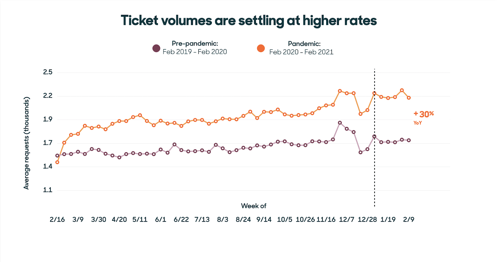
Zendesk research found that the COVID-19 pandemic had a serious impact on customer support tickets. The transition to digital saw record engagement from customers, leading to agents handling 30% more tickets than the year before. Rather than fading away, this trend has become a new baseline.
Customer support tickets help document issues and can be a valuable source of knowledge base articles. These can then be used to help customer service agents provide Knowledge Centered Service (KCS)®* that shortens average handle time. They can also feed your customer portal or community forums to help customers resolve problems on their own, reducing impact on your contact center and freeing up agents to help in more creative ways.
Ticketing systems can be further supported with skill-based routing, which helps ensure that the best qualified agent is assigned. This, of course, means that you’ll need to collect the right kind of information to ensure that the ticket is routed in the best manner. That’s why you should think carefully about your customer support process — this is an important touchpoint between you and your customers.
The case creation or support ticket submission can be an area of case deflection as well. By implementing a platform that collects the right information and matches it with existing content, you can deflect known issues by giving customers answers to their problems.
Here’s what to consider when building your case submission process.
8 Customer Support Ticket UI Design Best Practices
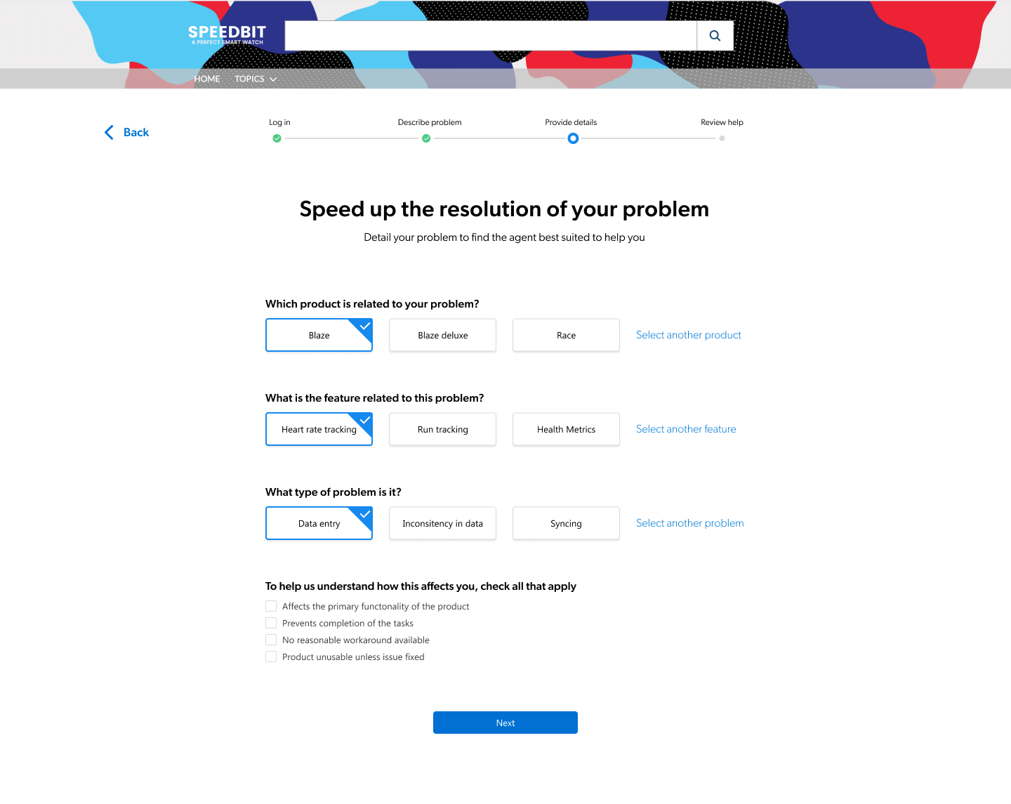
1. Split the support ticket process into steps
Chunking, according to the Nielsen Norman Group, is breaking a larger item (whether that’s a concept, content, or, like here, a process) into smaller pieces. This helps visitors process and recall information. By breaking a process down into steps, customers can focus and provide the info your customer support team needs to help them.
In testing our Case Assist tool with a group of early adopters, we found that they often used between five and 10 questions in their support ticket system process. Especially when presented with other hurdles like a required login page or document recommendations that attempt to deflect tickets, that’s a lot to dump on a customer. While there is no “right” number of questions to ask, the fewer, the better. Simplify by showing the whole process before a customer even starts — this sets expectations of what’s to come, and even primes them to provide certain information at certain times. It can also help motivate customers toward completing tasks! Progress bars are great for this.

2. Start off easy
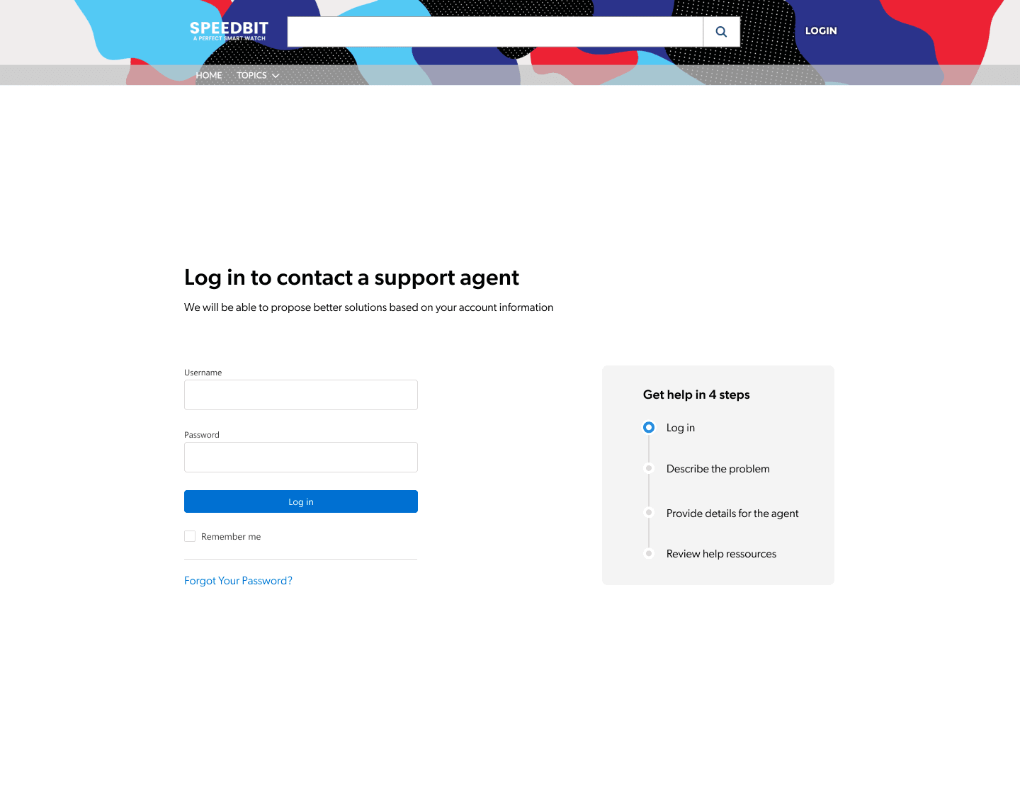
Ask for login only if required
Asking for registration and login might stop a support ticket before it’s started. Always explain why you need a customer to provide their contact information — they’ll be more inclined to do so when they understand how they benefit. People need to trust you before giving personal information.
Our research included asking testers to submit a support ticket in a B2C scenario, where they received an error message from a sports watch. Most were reluctant to log in because they didn’t feel it was necessary in that scenario. “It’s too serious; I wasn’t expecting to have to log in,” one of our testers explained. “I’m used to navigating without having to login.”
If your customers already have an account and are used to being logged in, it might not be an issue as the trust is already built. One of our testers said, “For SaaS, I’m OK with being asked to log in because I’m always logged in anyway. It makes sense to have an account if it’s a tool I’m using on a daily basis.”
Be clear about the form’s main goal
Seventeen percent of our testers weren’t sure if the information they provided in the form was going to reach a human agent. Generic labels like “Get help” or “Have a problem?” can refer to other types of help resources like customer self service documentation. With all the different support channels available that don’t always involve speaking to other humans, customers might be unsure of where your form will lead.
Avoid ambiguity and say that a human will read their case! It can impact how customers describe their issue. In our test, we saw a user use only bullet points because she wasn’t sure it would actually reach anyone. Testers that did not express doubts about their case reaching a human wrote descriptions in more complete sentences.
3. Help customers describe their problem
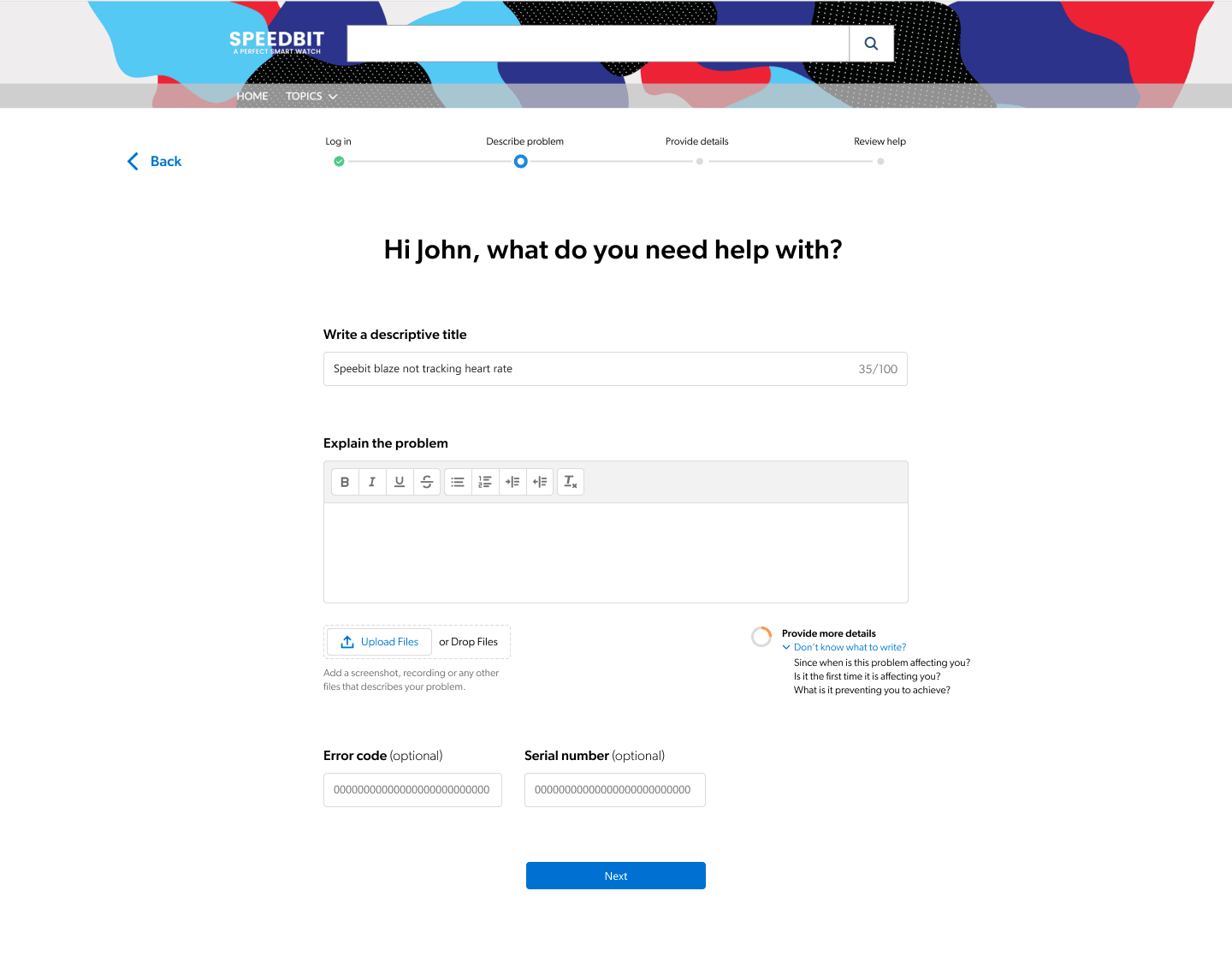
Within each ticketing system step, provide the fields customers need to answer the given question. A good rule of thumb is about five fields per page. Think carefully about what fields are truly important for a customer to gain a resolution to their problem. And if you decide to use optional fields, make sure they bring value and mark them clearly.
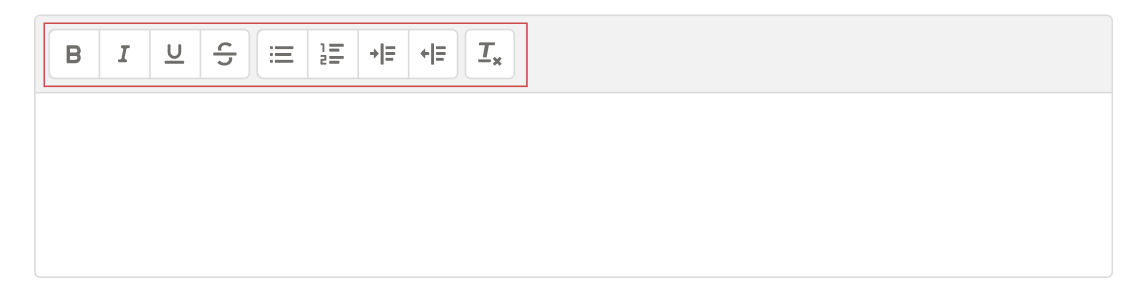
If your company usually handles complex issues that might require long descriptions or steps to reproduce, providing text formatting options (bold, lists, paragraph, etc.) can allow for clearer descriptions.
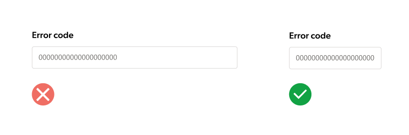
Text field sizes should match the expected input length. If you know exactly how many characters your input requires, the field should only allow that number. For example, if an error message contains 10 characters, the field should be 10 characters long.
Guide users on how much description to provide
Sometimes it’s hard for your customers to know where to start when describing a problem. Maybe it’s occurred erratically — enough to be annoying, but not on a consistent basis to know what’s causing it. Or if their focus is solely on the fact that they’re not getting a desired result, they may not realize they’re missing a crucial step. Help users help you by providing tips on what to include in their support ticket description. To achieve this ourselves, we tested a description strength component that showed a customer’s progress while typing.
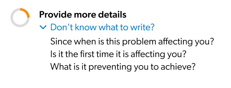
With a circular progress bar, our testers understood how effective we found their descriptions and were encouraged to add more. Still, some quickly exhausted what details they could think of. “I have to add more?” one commented. As shown above, make sure to provide hints on what type of information you need.
4. Streamline case classification
Classifying customer issues is a quick way to ensure problems are routed to the person or group best capable of handling and resolving them fast (also referred to as skill-based routing). Simplify the process with artificial intelligence (AI), such as with the case classification feature of our Case Assist tool.
By adding Case Assist as a second step, the tool reads all of the input from the case description page to suggest the most relevant categories to your customers. This is also a great place to ask for the “severity level” of the case as well.
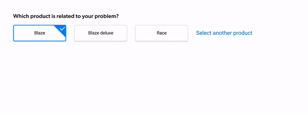
Show a limited number of suggestions
Giving users too many choices can be overwhelming. Case Assist recommends the most relevant categories, allowing customers to avoid browsing through a long list. It would be best to only show three suggested classifications, which is a good rule of thumb to avoid overburdening customers with choice and ensuring the suggestions stay relevant.
Allow customers to choose an alternate classification from a drop-down that shows all of the choices. If a choice is made in the droplist, the suggestions made by Case Assist disappear, leaving only the drop-list accessible. That way customers focus on one element at the time.
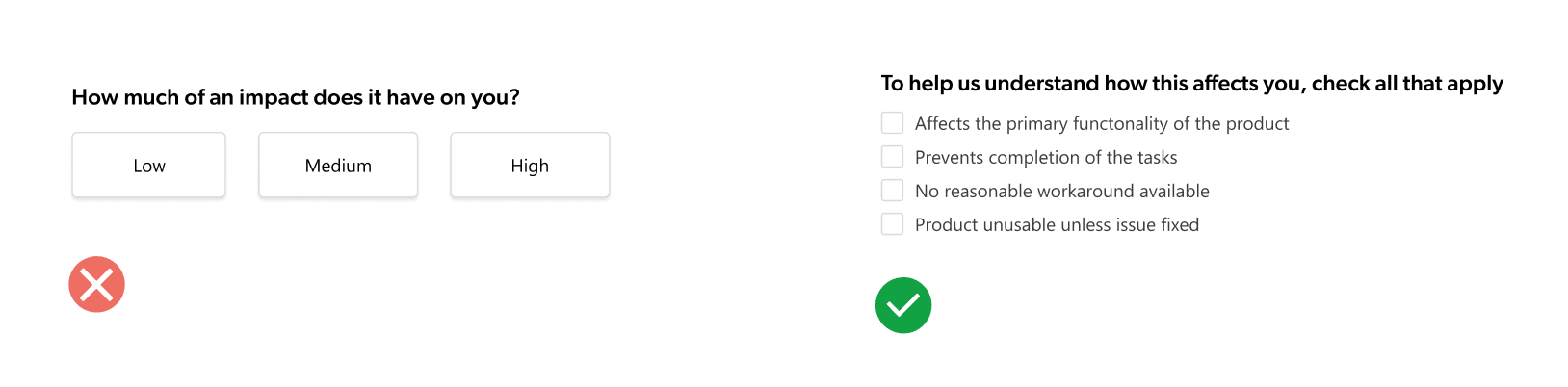
How you ask for the severity level matters
Severity level is a difficult concept to quantify, because what’s severe to one person isn’t to another. In our research, testers often selected a higher severity than necessary to avoid “being stuck in the backlog forever.”
Testers questioned why they had to provide that information at all. “Why do they want to know what the severity [of the problem] is? I still want my problem to be resolved!” One commented.
Instead of bluntly asking users to rate their issue from high to low, we recommend giving concrete factors to choose from that might affect case severity. As one of our testers said, “Low-medium-high is kind of the worst way [to rate severity]!”
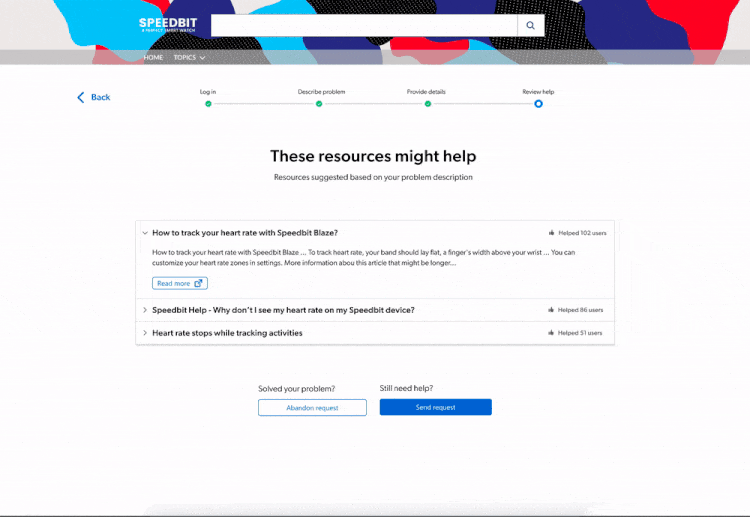
5. Suggest helpful documents for faster resolution
To aid in self-service (and ultimately case deflection!), this is a good point at which to offer documentation, videos, or other content that might solve the customer’s problem. You can do this via a recommendation system. By pairing this with AI, your ticketing system process can understand the customer’s issue and suggest relevant solutions directly within the form. Our Case Assist tool offers such functionality.
How should these documents be displayed in your support request form? We’ve got a few ideas.
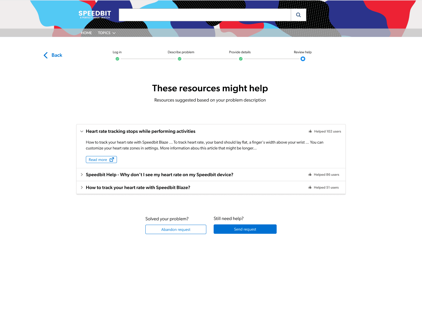
Give help documentation its own step
Choosing where to showcase customer service content is an important decision — to find out what works best for your customers, test! During our tests, putting document suggestions on a page of their own increased the clicks on documents by a factor of 2.5. This might be because users have only one task to complete on the page; i.e., look at and evaluate content suggestions without any distractions. However, what works best for your customers can only be decided by your customers, so test different configurations and collect feedback.
Even if you decide to offer related customer service help content, make sure customers can skip this step and complete their case submission process if they want to. It’s important not to block your customers from moving past this step!
Show a limited number of documents
To save time, customers will only click on links that seem like a solution to their problem. And we already know that too many choices makes it harder to choose. Most importantly, users have most probably searched before contacting your customer service team. We would recommend showing between three and five documents, as it is a good balance between providing help and not overwhelming them.
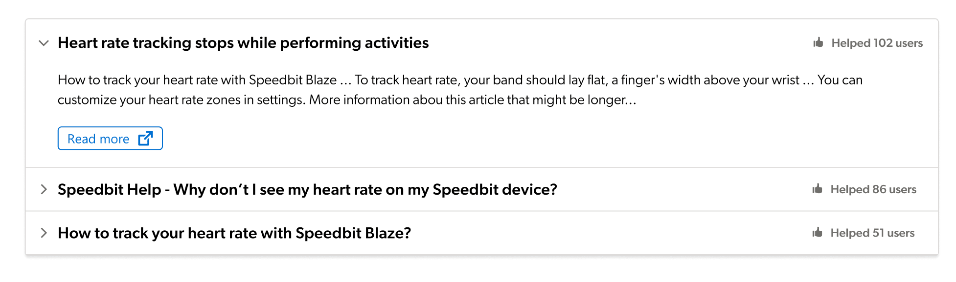
Present documents in an accordion to track more data
Displaying documents in a traditional list works as well, but we suggest using an accordion to display documents for two reasons.
First, it allows for progressive disclosure , which aims at minimizing the chances that users feel overwhelmed by what they see — basically, by not showing everything at once. Instead, let users trigger and control what gets displayed and when. This lets visitors concentrate on one document at a time.
Second, you can track more data. Was a document ignored because it wasn’t helpful, or because the user didn’t see it? With an accordion, you can track one more data point: whether the document was expanded or not. A click to expand the accordion gives certainty that the document has been seen, but no click to open might imply that it wasn’t what the customer was looking for.
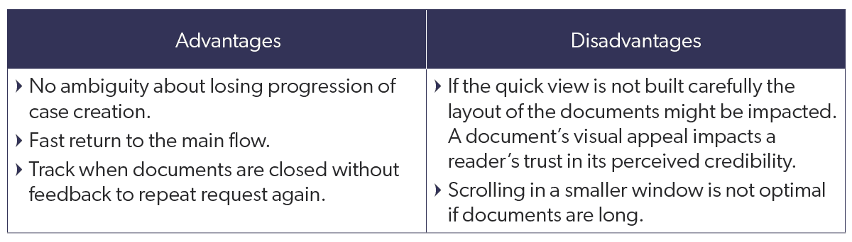
Define how your documents will open
Now that you know how to display the documents in the form, how should they open? We suggest two options: in a new tab or in a quick view option. Here’s a list of pros and cons to help you decide.
New Tab
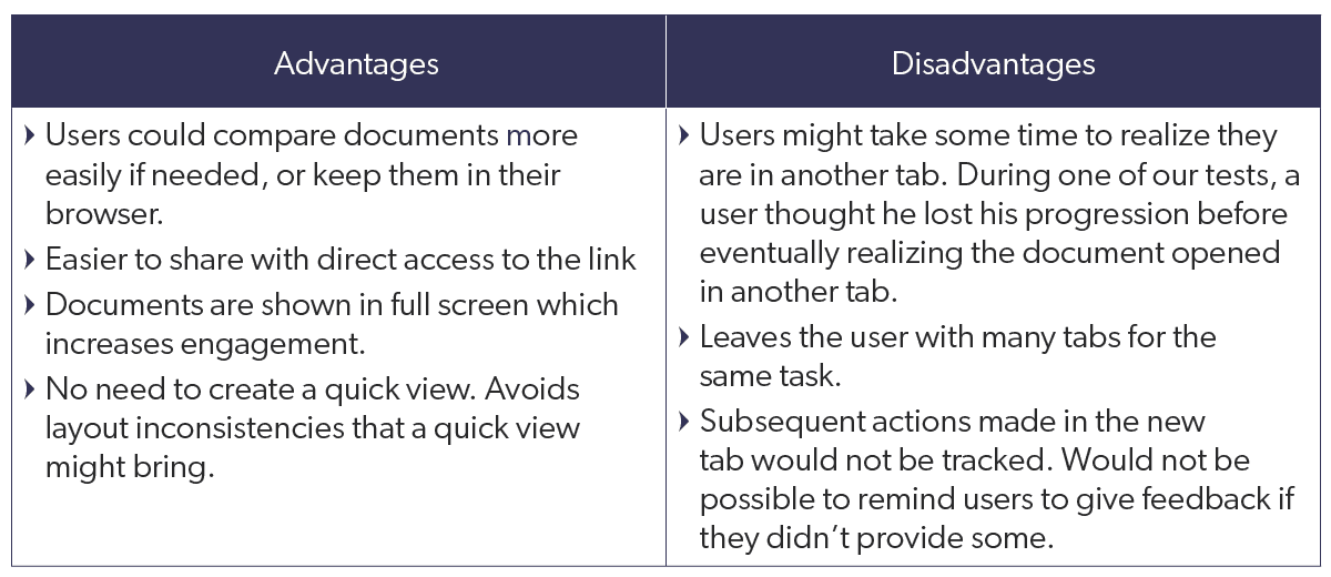
Quick view
Show how content has helped other users
Customers value the opinions of other customers; as one of our testers put it, they found community commentary “more honest” than corporate information. But you can leverage those opinions to help customers find answers.
Whether with symbols, numbers, or both, you can show how helpful users have found a particular piece of content.
“I love seeing how effective an article has been at resolving a problem,” one of our testers said. “It guides where I click.”
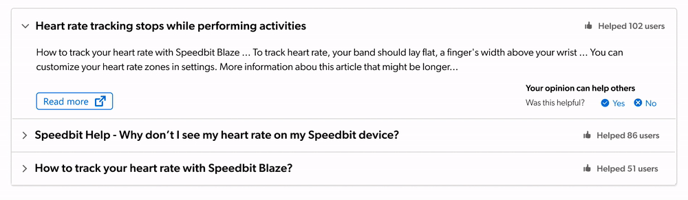
But to display such a rating, you need to first get feedback.
6. Nudge customers for feedback on content
How do customers really feel about your support content? There’s only one way to find out, and doing so helps you identify content gaps and better understand your customer’s journey. This is why we added a content evaluation option in our tests, as well as a way to explicitly say they no longer need help after consulting suggested help documentation (i.e., confirmed case deflection!).
Unfortunately, our research showed that few users take the time to provide feedback on content helpfulness. “I don’t have the reflex to mention when it’s [the document is] helpful,” one tester said.
This doesn’t mean you should make feedback mandatory! Instead, here are some suggestions to gently nudge customers for feedback.
Ask for feedback at the right time
Waiters wait until you’ve eaten a couple of bites before asking if it’s good. So wait until after users have read content before asking if it helped! Thus, feedback options should be at the end of documents.
Since there’s a good chance they’ll ignore it, gently remind them to provide feedback at key moments. When users dismiss content is a good time to ask for feedback. If you offer a quick view option, you can track when a user dismisses that view without providing feedback. Once the user has returned to the form, you can ask again if the content was helpful.
Show that their opinion matters
Part of what drives us to provide feedback is knowing that our opinion might help others. Why not tell your customers exactly that? Provide visual cues that the feedback was received by changing the Feedback Widget’s color or wording. Even better, show that their opinion impacted the helpfulness score by adjusting the score based on their feedback.
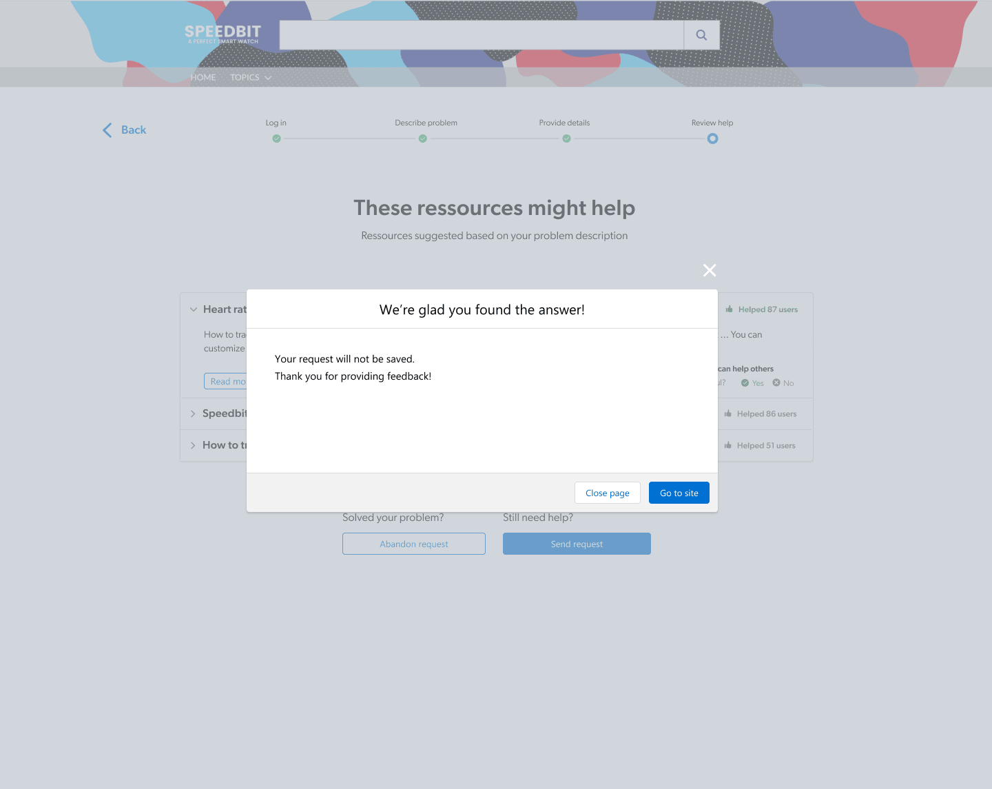
Offer a deflection confirmation
If customers found what they were looking for with the suggested documents, let them tell you. Even if most users will not use the “Abandon Request” button, it’s still important to design a step that closes the cycle.
Instead of closing the form right away, offer a modal asking for confirmation that the user no longer needs to submit a case. This way, if a user accidentally clicked the button, they have a chance to avoid losing their progress. It also provides confirmation that they found an answer to their question or a solution to their problem—case closed!
7. Decide if your customers need a summary
Should you have a summary or review page before users can submit their case? It’s hard to be sure if a summary/review page is helpful to users.
Best practices (if you’ve been following our guidelines!) say that the ticketing system process should be quick and require minimal information. With this in mind, a review step seems a little superfluous, doesn’t it? The customer was there throughout the whole support journey, filling out the ticket. What’s even more important is that, even though they’ll have submitted their support ticket, this isn’t the end! It’s the beginning of the conversation with your customer support team. Unlike a purchase that is not editable, cases will evolve during the customer support journey.
The final decision is yours; maybe your industry requires specific information and intensely detailed descriptions. Because of this, it could be reassuring for your users to be able to review their input for errors.
Once on the summary step, avoid asking for more information. During our research, we saw request forms where additional information was asked at this step. Users would not expect to provide more information on a summary. If you ask for additional information, it’s not a summary!
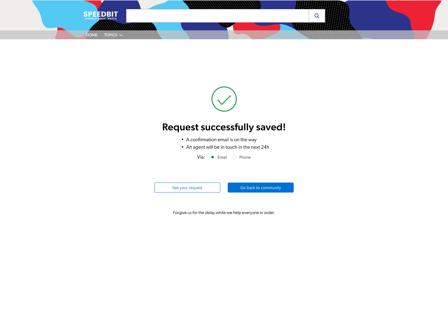
8. Always confirm the case was submitted
How do users know when the ticketing system process is complete? With the confirmation page!
Users should understand at a glance that their case has been submitted. Cues like green check marks and a short explicit title work well. To end the journey on a high note , add delightful imagery or animation. Last impressions are what we remember best!
Offer users an estimation of when they should expect to get a response. Our testers appreciated being able to choose how they would be contacted by support staff—if you can allow that flexibility, it could be a plus!
The Beginning of Your Customer Support Journey
Like we mentioned above, the case creation process is really the first step of a much longer conversation between customer and agent. Making sure the support ticket steps are fluid and capture all of the necessary information just assures that the conversation will be a productive one!
Customer support is an iterative and growing process that does and should change over time; as customer needs change, as products evolve, and as businesses grow. What might work for you today may need to change tomorrow.
These best practices give you somewhere to start, but remember — research, test, rinse, repeat!
Dig Deeper
Before you start with Coveo’s Case Assist, we have additional advice! Check out our insights on gathering requirements for your case creation experience as well as advice on designing your form.
You’ve looked through how to improve the customer side of the support journey — what about your support agents? Find out why they need an insight panel.
Interested in learning more about self-service? Check out our 6 Techniques for Self-Service Success ebook.
Ready to find out how Coveo can improve every service interaction? Here’s how AI-powered service can quickly connect customers to answers and gather insights, even across silos.
*KCS® is a service mark of the Consortium for Service Innovation™