
Nowadays, customers expect organizations to offer them not only the best product but also the best service. Good customer service means having all the information and tools at hand to self-serve. It also includes easily finding needed support to achieve a solution in a timely manner.
81% of consumers attempt to resolve issues on their own before reaching out to customer support, and 71% want the ability to solve most issues on their own.
—Help Scout
To help organizations on these two fronts — customer self-service and support — Coveo offers Case Assist. During the case submission process, Case Assist suggests documents related to the case information that the customer has provided. This empowers customers to efficiently find answers for their issues in which they would have otherwise contacted support. In other words, case deflection increases.
The Importance of User Interface Design to Optimize Case Assist
Suggesting documents during the case submission process, however, is not enough to empower customers to find the solutions that they need. While the quality and relevance of the content you suggest is important, how you present it is critical, too. There are visual design best practices that play an important role in case deflection.
Incorporating well-constructed visual elements lets customers (1) focus on what’s important for them, (2) easily absorb complex information, and (3) intuitively know their next step. By designing a Case Assist process following user interface (UI) best practices, customers are more likely to have a seamless and intuitive experience, while encouraging them to self-serve.
If your interface is intuitive, you won’t just get fewer bounce rates. You’ll also get fewer complaints with customer support, which can significantly reduce the expenses you have for it. Thanks to a functional, simple interface, you can minimize doubts, errors, and unwanted actions, as well as bad word of mouth.
—Lucas White
3 Case Assist UI Design Best Practices
UI Best Practice # 1: Less Is More
Displaying less information at one time to a customer allows them to make a faster decision that they’re satisfied with. “Choice overload” suggests that people can become overwhelmed with a large number of options. This is where Hick’s Law comes into play, which suggests that the more options presented, the more time it takes to assess each. When customers finally make a decision, people often feel dissatisfied and ponder whether they should have chosen a different option.
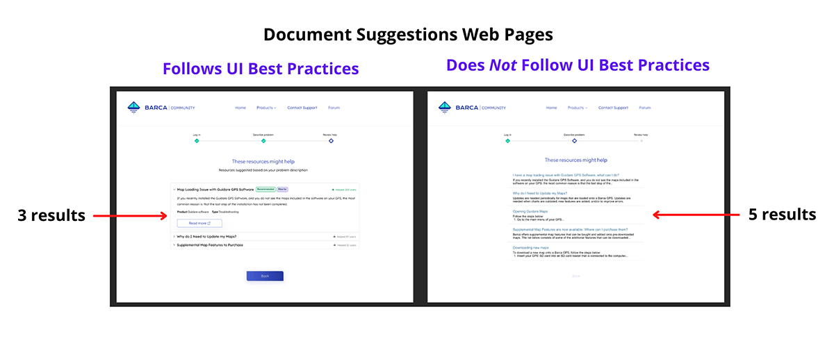
Indeed, these psychological principles transpired during our Case Assist research. Participants who experienced the case assist process thatdid not follow UI best practices spent more time (on average 1.5 minutes) scanning the first document suggestion than those who experienced the process thatfollowed UI best practices (on average took 1 minute). Why? More results were displayed to them (i.e., five results rather than three; see image 1).
In fact, one participant said, “I would say narrow the suggestions more. Two [i.e., the last two document suggestions of the five in the case assist design that did not follow UI best practices] were not helping at all. So, I would try to narrow them to be even more specific…It would be better because then the options are actually helpful, compared to just the ones that have keywords.”
Several participants emphasized that they preferred three highly relevant document suggestions rather than a longer list that wastes valuable time and energy to sort through.
UI Best Practice # 2: Prioritize Importance to Improve Focus
In addition to fewer options, progressive disclosure is an interaction design pattern that gives customers only the most important information, with more options available upon request. This best practice helps users focus on what is really important. Individuals can only pay attention to so much information at once. Simultaneous demands can leave users feeling overwhelmed — which is why it is best to only show the most important information, leaving everything else optional to view.
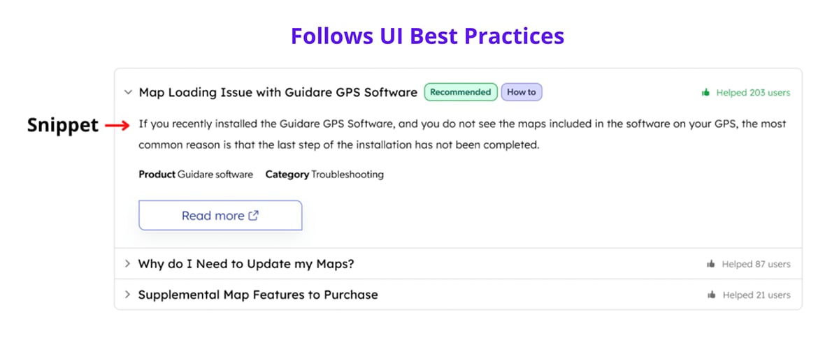
One way to do this is with a snippet (i.e., a brief information extract), making the Case Assist experience more efficient and satisfactory. Participants who viewed the UI best practice-designed document suggestion page were presented with one complete snippet at a time. The first document suggestion’s snippet was automatically displayed (see image 2).
If participants wanted to read the second or third suggestion’s snippet, then they could click on the drop-down arrow next to the suggestion’s title or the title itself. This would simultaneously present the chosen document’s snippet, and close the first suggestion’s snippet.
One participant said, “I liked Design B [i.e., the design that followed UI best practices]. Not everything was there all at once, which I found helpful [i.e., referring to the gradual display of snippets]. It was less overwhelming and less wordy. When I look at something and there’s a bunch of words, my brain checks out… When you click on one thing at a time [i.e., the drop-down arrow to present one snippet at a time], it makes [the results] less overwhelming.” Participants clearly appreciated the gradual display of snippets, as it allowed them to focus without being overwhelmed by supplementary information.
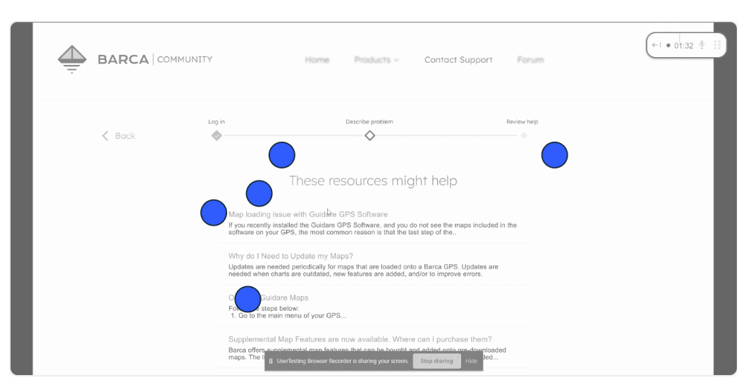
In contrast, heat maps used during the study (see image 3) showed that participants who saw five article titles with snippets (in the case assist design that did not follow UI best practices) were hesitant to click on the first result. They went back and forth between options before making a decision. This likely was because they were overwhelmed with information.
UI Best Practice # 3: Visual Cues Help Users Absorb More Information
According to information-foraging theory, users will evaluate a webpage based on the probability and speed of getting an answer. They take what’s often called “information scent,” or the strength of visual and textual clues communicating what a page or link may contain, into account. The more closely an information scent matches a customer’s inquiry or goal, the more likely they are to investigate a page.
In our Case Assist research, UI elements certainly acted as information scents. Many participants voiced that badges and social proof in the form of a thumbs up and “helped 203 users” (see image 4), were not only visually appealing but encouraged participants to read the document.
More specifically, these “scents” communicated trust to the participants and convinced them that the document suggestion would contain useful information related to achieving their goals.
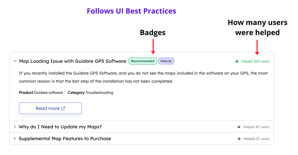
One participant stated, “I like this set up better [i.e., the design featuring UI best practices]. It has more information. It has ‘Recommended’, it has ‘How to’ [i.e., the badges]. In a way, it is much more descriptive. It even has that it helped 203 people… It’s just easier to look at, and you can just quickly go and see, “Oh, it’s recommended! Okay, I’m not going to even read anything else.”
Participants clearly felt from both the badges and the thumbs-up icon that the solution to their hypothetical problem would reside in the first document suggestion — another successful (if potentially nonexistent) case resolution achieved by Case Assist.
Conclusion
On its own, Case Assist is one avenue to encourage customers to self-serve even during a case submission. Of course, suggestions are only as helpful as they are well-packaged; our research shows that paying careful attention to UI design best practices helps optimize Case Assist benefits.
By understanding how users behave and react to design, you can foster positive Case Assist experiences. Interested in learning more?
A special thanks to Antoine Bégin for creating the designs used within our research.