
Many factors play a role in keeping customers happy or even ”delighted.” However, it can be difficult to know which factors work well without the data to back up your assumptions – like whether they choose to log in or not.
Is your website intuitive along each touch point? Are your customer support agents providing accurate information in a timely manner? Are out-of-stock notifications creating frustration for shoppers online?
Since all of these issues can create the same outcome (customers abandoning carts or not returning to shop again), figuring out which one(s) are the culprit must happen quickly. In fact, with 68% of consumers happy to pay more from companies that offer good customer service, it may be the best way to boost profits in light of uncontrollable forces pressuring businesses today — such as inflation, supply chain issues, and a labor shortage.
One way to narrow down the possibilities is through relevant search data. Created every time a customer takes a specific action on your site, search can hold the key to what customers are doing at important steps in their online journey. With the right tools to capture, analyze, and display this data, you can make better customer service decisions, create the self-service content customers want, and see a shopper’s experience improve significantly.

Here’s how search data fits into the customer service analytics paradigm:
What Is A Search Event?
Before we can get into the reporting details, it helps to understand what a search event is. When using an AI-powered platform like Coveo, measuring search events helps you report on customer behavior.
Any time a user enters a query into your on-site search, it counts as a single search event — but it goes far beyond that. Filtering results, clicking tabs, or doing a quick view on a document result are all examples of search events. Any interaction on a Coveo results page is considered an event, and it’s possible for a user to have multiple events in pursuit of a single satisfactory result.
The important thing to remember is that each click counts as a piece of data that serves one of two purposes:
- Feeds machine learning to help results get better over time
- Creates a trail of data insights that can be viewed as useful analytics from the admin dashboard
That may sound a bit intimidating since some of the most powerful analytics reporting tools have a steep learning curve. That’s not the case with Coveo, however, and we’ll explain how to get the most out of it next.
How To View Top Analytics Reports
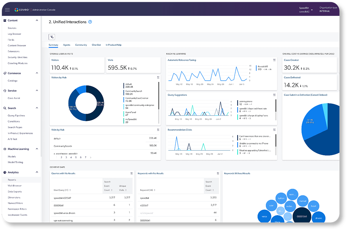
Here is an example of what you may see in the dashboard of a search relevance platform’s analytics:
Pedro visited your website from Oregon and had nine search events, including looking at the quick view and changing facets. We can see the search term he started with, the response time for getting search results, and the total number of search results for the term he chose. If he clicks on a document, we can see which document, the author of the document, and the help pages or resources that sourced that document.
Most marketing teams aren’t going to want to take the time looking at individual users, however, and this data is incredibly hard to parse on its own. That’s why most marketers and site administrators will use the data that bubbles up from each of these individual user experiences to feed into a larger data reporting segment.
For that reason, we recommend getting to know the most common and valuable reports in the next sections and how you can use these reports to improve customer experiences directly.
Most Important Search Metrics for Customer Service Analytics
You’re likely to get overwhelmed with data if you’re not focusing on simplified, actionable reporting views. It’s just too much for the average user to care about.
If you focus on the following four metrics categories, however, you can get good insight into each digital experience, whether it’s a customer trying to find a colorful sweater or your customer service agents narrowing down the proper product manual.
They are:
- Visit click-through rate
- Search event click-through rate
- Average click rank
- Content gap
Visit click-through rate
This metric answers the question, “of everyone who is coming to my site, what percentage of those visitors are actually clicking on a result?”
You will get a lot of visitors, and some may even enter a query or two. You’ll only see the ones that find and click a result, however, here.
How to use this information: If you have many visitors to your site, but few or none are clicking on search results, it may mean they aren’t finding your search box at all, or they are only somewhat interested in following through on finding the right information.
Check to see whether your search box is prominently displayed on every page of your site and that it’s easy to locate immediately. You may have to call it out for visitors who don’t know where to look and drive that customer interaction.
Search event click-through rate
This metric is similar to the one above but has a very different purpose. It is more precise and looks at “out of everyone coming to the community, how many clicks are taking place based on the number of search events happening?”
Remember, sorting by filters, clicking to the second page of a search, or even refreshing a web browser is a search event. It measures all events against the number of search result clicks for the same user in the same session.

How to use this information: If you find that it takes many search events before visitors find suitable search results to click on, there could be a significant lack of quality results, or your website design requires too many clicks to see the best results. This is a sign of a challenging customer journey. You want your site visitors to see the most useful results early on in their journey, and you want it to be easy to find what they are looking for. You don’t want them to click and refine six times for every search click; that will not give them a good user experience or help with customer engagement.
Make sure your UX design prioritizes search results above the fold and doesn’t require a lot of scrolling or clicking around.
Average click rank
When a visitor does decide to click on a search result, which one do they go for? Is it the first result? The second? One lower on the page? In an ideal world, they will click the first result, as it shows your search results are fine-tuned to what similar users have found useful.
How to use this information: Anything that’s on the front page and above the fold is a good goal, however. (Since this depends on your site design, specifically, as well as the type of browser or app the visitors uses, your idea of good may not be the same as someone else’s.) If they have to scroll to see results, those ranks should not be your goal, as it represents the user having to work harder to get the info they came for.
Again, this could be solved with UX updates to your site and making sure customers can see the best results on desktop and mobile. If the more relevant search results don’t bubble up to the top of the list, you could be experiencing a disconnect between customers’ actual search terms and what you think they may be searching for or should see.
Content gap
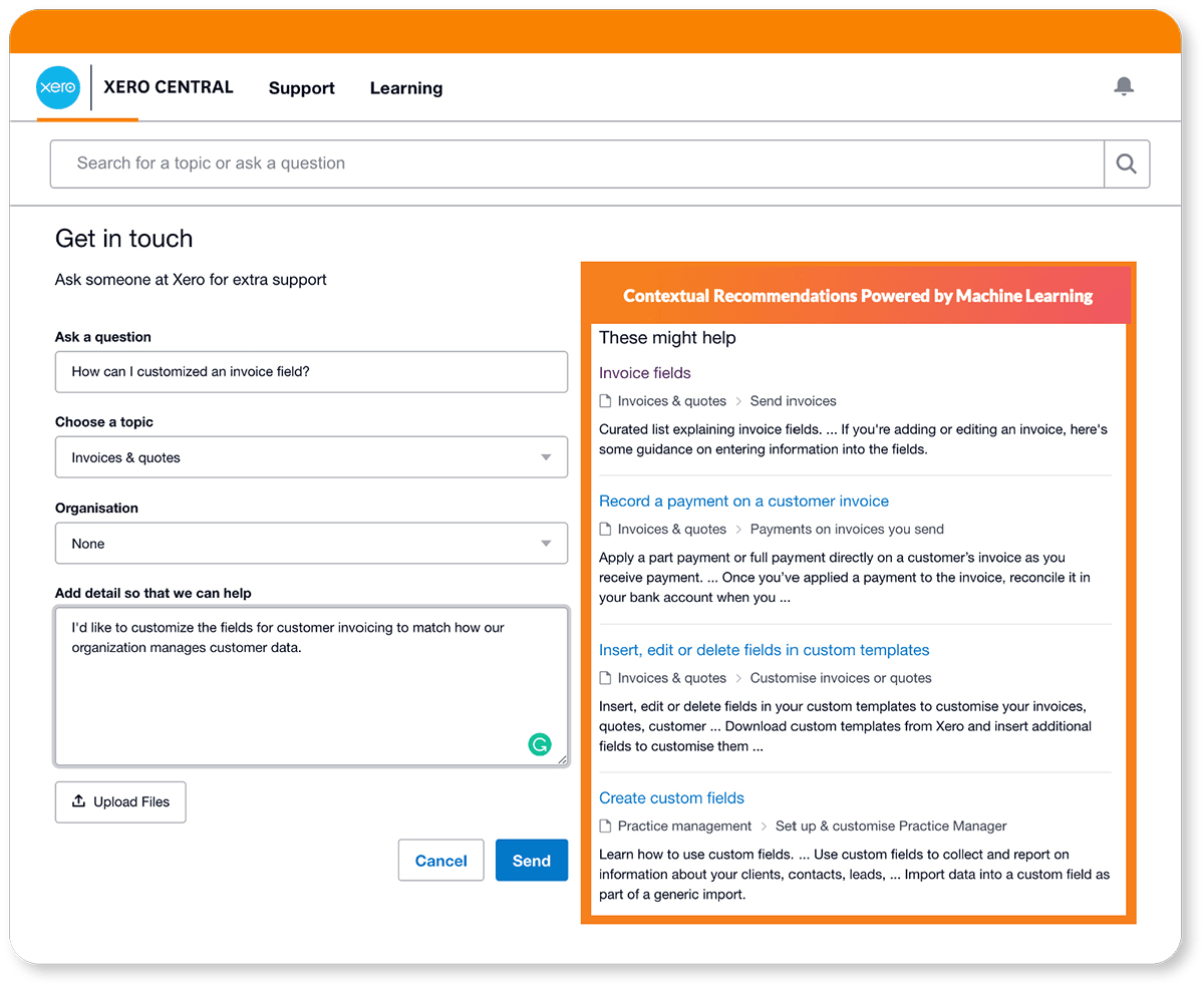
The difference between the content your users search for and the content you make available is known as your content gap, and Coveo can measure this with a helpful ratio. This metric is very helpful if your company engages in case methodology.
One way to see just how representative this number is would be to look at the actual queries being used and are coming up with no results, then sort by unique visits to see just how many people have been affected by this lack of content. If you see it was a case of just one person, this content gap isn’t likely to be the place you start with (especially if it would involve creating new documentation.) If the content gap represents many users with the same issue, or it’s simply a matter of linking another resource, then that example might be something to tackle next.

Hit the content gaps that affect the most people or that bring the best ROI for the work you have to do to resolve them.
How to use this information: Content gaps are an excellent metric to share with your documentation teams, as they are the ones often creating this content. You might also use the “Documentation performance” tab by hovering over it and looking for the hand. Then click to see a top-level filter for the entire report. This data can tell your teams if the latest piece of documentation they’ve created is actually being found and seen.
How Does All This Data Apply To Better Customer Service?
Whether you use all the reports available in Coveo or just a few, the potential to boost your customer service or agent service IQ is immeasurable. Consider all the ways you can improve search, even without the use of artificial intelligence or machine learning to create better results over time.
Content gaps tell you what people want to see in search results, along with the exact terms they are using. If you see frequent gaps in search, you can try a few solutions:
- Create the content that customers want to see
- Acknowledge the search terms people use by including them, so they still see the results they want, but by another name
- Educate your users on what terms they should be using, either with better customer or client onboarding or through branding shifts
If you’re seeing a high number of search events before someone gets to a search result they like, a couple of things could be happening here.
For one, you could have UI or UX problems. Customers may be clicking around, not because your results aren’t relevant, but because they need to do more things to get to those relevant results. Whether it’s adding more filters or clicking to the second page, customers don’t want to work hard to get the information they want.
Your challenge is to streamline this process and put the good stuff on page one through a combo of better site design and relevant search.
Product search vs. documentation search
Customers today use search so much that they turn to it as a solution for almost everything in their lives. When visiting an ecommerce site, they may instinctively put a search term into the first search box they see, unaware that the box may be designated for only product inventory or customer service documentation.
The best websites make no distinction between the two and serve customers with either need. A shopper typing in “blue scarf” and a customer typing in “how to return” should be able to use the same search interface with satisfactory results.

Coveo’s relevance platform makes it easier to connect various data sources so that customers have just one seamless way to look for what they want. Since they are often unaware of what happens on the backend, it’s up to you to create a great search experience that improves their customer experience then use all of the collected data to continually refine it.
The Bottom Line For Customer Data Analytics
Improving the customer experience is an ongoing process, and the cost of not doing something is high. (We know that 74% of customers would walk away from your brand if another provided a better customer experience.)
Fortunately, as you get more customer service analytics data, you’ll have a better idea of what you need to do to improve. As soon as you make those changes, however, customers’ expectations can change, giving you even more new data to work with.
Instead of getting frustrated with this living, evolving dilemma, understand that manual adaptations (UX or creating new documentation) are only half of the equation. With AI and machine learning, some of that can be fixed automatically as you go. Coveo’s technology takes over a lot of the manual work required to give customers relevant results, so you can focus just on those things that need to be handled by humans.
Dig Deeper
Interested in a deeper dive into understanding Coveo analytics? Check out our on-demand webinar, Reports and Analytics that Create Change, available now on our website for free.