

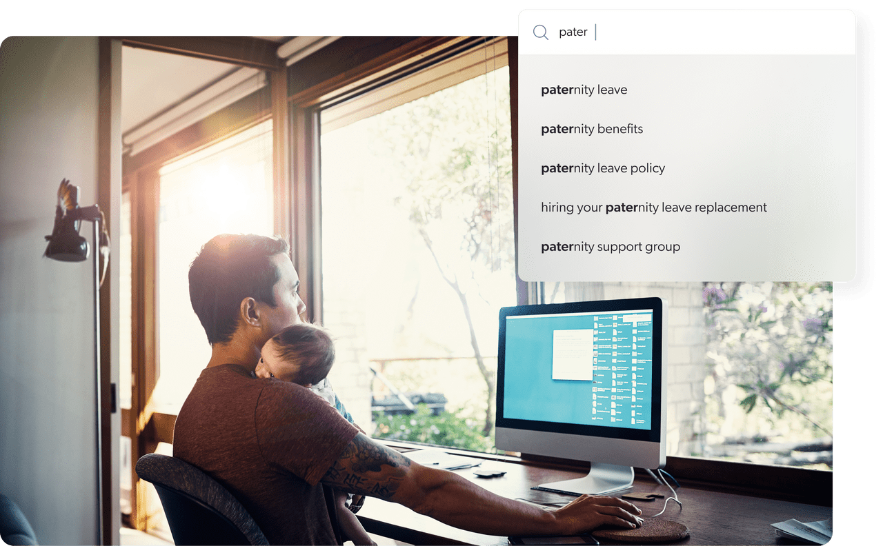
Did you know that, in 2018, Google estimated that Google autocomplete suggestions saved users 200 years of typing time a day?
(Imagine what that number must be in 2024!)
If your site is one of the 80% that the Baymard Institute estimates offers autocomplete suggestions, make sure that you’re also one of the 19% fully optimizing them.
(And if you’re not offering them, now’s the time to think about adding autocomplete to your site search!)
Offering different suggestions right from the search bar provides the best user experience — one resulting in users finding what they’re looking for. Meaning users trust your online reputation — translating into brand loyalty. Meaning users will return to your digital experience again and again.
This blog article is all about best practices for an autocomplete suggestions, also called predictive search. There are some things to keep in mind when implementing autocomplete predictions to maximize usability of the feature and ensure it’s helping — not hindering — UX.
Below, we provide seven best practices for search suggestion UX design aimed at helping you create a more functional and user friendly on-site search experience.
What Are Autocomplete And Predictive Search?
Anything that helps users easily make a decision impacts their satisfaction and overall experience. Predictive search is one such tool. Like the name says, this search engine feature predicts what a user might be searching for, and is tied closely to what has already been typed into an input field like a search box.
Letters like “soc” could mean a searcher is looking for either “socks” or “soccer”.
But don’t get waylaid by simply offering users others’ popular searches — instead, you want to get close to what that individual is looking for. This can be best supplied via a combination of behavioral analytics and previous searches, also referred to as wisdom of the crowd.
The more information your search platform has about that user, the closer it can come to that specific user’s search intent.
By doing so, it saves the user time. Instead of asking the user to complete their keyword, it foresees plausible options and presents them to the user for him to choose.
Autocomplete, autosuggest, and type-as-you-find are the three core functionalities of predictive search.
7 UX Design Best Practices for Autocomplete Suggestions
1. Functionality over Aesthetics
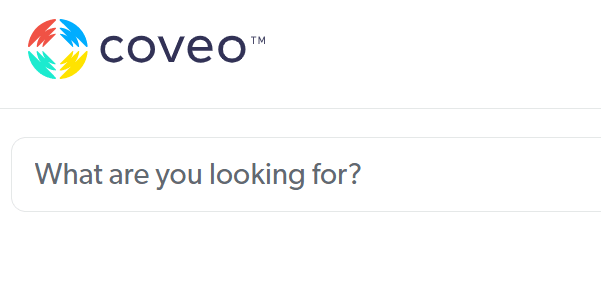
Your user input field should be easy to find, use a text-entry search field, and leverage a visual cue like a “magnifying glass” icon to indicate that users can search.
Adding a leading prompt inside the search field can help users orient themselves (e.g., “What are you looking for?”), as illustrated with our own search box below:
2. Focus on UX and Placement
Autocomplete features are only helpful if the placement of the search box is obvious.
In addition to being easy to find and use, the search box should be available on every page of your website. Put it in a place users expect to see it.
Research supports a search field that’s integrated with your website’s navigation, generally placed at the top right or center of the screen.
3. Avoid Common Interaction Issues
Pay attention to common interaction issues like lack of visible options when the user first activates their search box or only showing limited suggestions until a certain number of characters is entered. Here are some other things to avoid:
Inadequate font sizes
While the exact font size may vary, autocomplete options should be easily readable. Test font sizes on different devices so you can see how it appears across a range of devices, operating systems, screen sizes.
Cramped spacing
As with font size, adequate space for words and phrases contributes to improved readability. Font should be legible, with words and letters spaced in such a way that there’s no crowding.
Small hit areas
In the context of autocomplete design, “hit area” is the region that a user can click or tap on to select an autocomplete suggestion. Make sure you avoid small hit areas which can lead to mistakes or frustration. An appropriately sized hit area ensures that users can easily select the suggestion they want.
4. The Devil’s in The (UX Design) Details
There are a few design details that can not only improve UX, but also ensure that users are more likely to find the information they need. Make sure to:
Keep the autocomplete list manageable
Too many autocomplete suggestions can cause analysis paralysis in users. When suggestions exceed around 10 items on desktop (and around eight on mobile), users either ignore suggestions or spend too much time reading through them.
Differentiate scope and query suggestions
Scope suggestions prompt users to refine their search by narrowing down the list of results. For example, if someone types in “trees” into a garden center’s website, a scope suggestion could be “trees that thrive in California”.
Query suggestions suggest specific queries based on what a user types into the search box. These should be differentiated visually (e.g., through distinct colors, font weights, or icons).
Highlight suggested queries
A suggestion should appear when the user starts typing and remain visible until the user selects an option from the autocomplete list.
Highlighting the suggested query text helps users differentiate what the autocomplete is suggesting versus what the user typed in.
In the below example from Coveo’s search box, the user typed in the word “knowledge.” In the list of suggested queries, the autocomplete text is bold so it easily stands out from the user’s query.

5. Adhere to Desktop Best Practices
On desktops and laptops, autocomplete UX should focus on keeping search uncluttered, enhance usability, and reduce user frustration/confusion. Best practices include:
Offer keyboard navigation
When on their desktop, many users are comfortable navigating many search features using their keyboard navigation.
This means up and down arrows should navigate, as described, up and down a list of autocomplete suggestions.
The return key should submit the user’s choice.
Limit Number of Options Shown
To avoid choice paralysis, show a limited number of autocomplete suggestions. This also helps ensure that autocomplete suggestions are visible without scrolling.
If the input field has a fixed height, then it may force users to scroll through results, which can be challenging for users.
Lower visual noise
Visual noise like images, too many colors, and keyword separators can look cluttered and ultimately confuse users.
Keep it simple with a limited list of suggestions that get users to where they need to be without too much fuss.
Highlight the selected (“active”) suggestion
The active autocomplete suggestion is the suggestion that is highlighted or selected by the user. The user makes their selection by hovering the mouse over the term or phrase or using the arrow keys to navigate through the list of suggestions.
Highlighting the active suggestion with a different background or text color helps distinguish it from the other autosuggestions.
Make search stand out on the page
Give your entire search bar — including the autocomplete feature — visual depth so that it stands out from other elements on the page.
For example, give it a clear border or dim the webpage when a user activates search.
Use title case
Presenting autocomplete suggestions in title case (or “headline-style”) makes them easier to read.
6. Adhere to Mobile Best Practices
Autocompletion is a highly interactive and transient experience which can confuse and derail users, particularly when they’re searching from a smartphone or other mobile device. Adhering to mobile design best practices is essential.
Here are two guidelines to keep in mind:
Limit visual competition
On mobile, it’s particularly important to reduce visual competition from external elements like ads, chatbots, and images. Since screen size is small, your search bar is competing for limited space and user attention.
Maximize search term space
Providing adequate space for autocomplete query suggestions is crucial on mobile devices. Design for visual depth and simplicity, use text wrapping, and obscure the last visible suggestion for optimal visibility of the active suggestion.
Finally, it should be intuitive for the user to exit autocomplete by clicking an icon like an X or “Exit” button.
Helping Your Users Helps Your Business
Autocomplete is an excellent way to optimize the search UX and improve the usability of your website’s search feature. But it’s also easy to overwhelm users with too many options or poor UI design.
By adhering to the best UX practices for autocomplete on desktop and mobile, you can create an intuitive and effective autocomplete search utility for users.
Learn more UX best practices that drive customer satisfaction:
Dig Deeper
Autocomplete suggestions are just one facet of a great search experience. Discovery other user experience best practices in our free ebook, The Ultimate Guide to Site Search User Experience.